 Vastrik
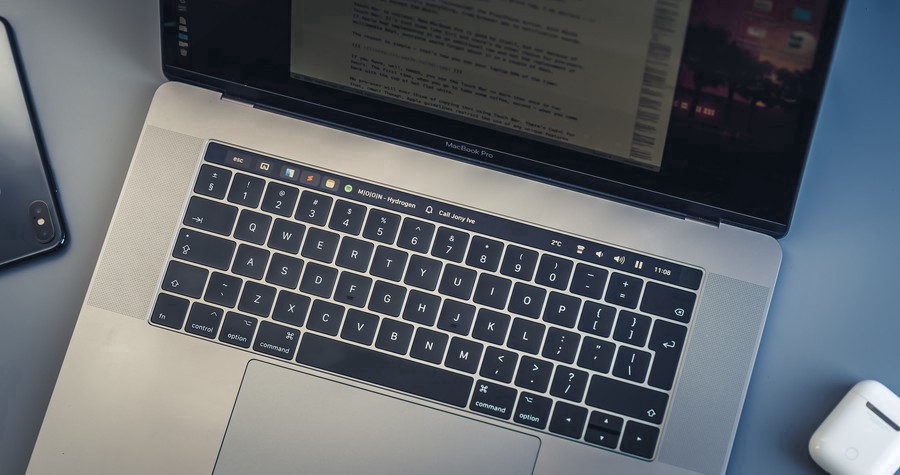
15-inch MacBook Pro with Touch Bar is my main work tool for more than a year. I use it every single day, all day long — to code, to process photos, and to write my blog posts, of course.
Back in 2017, I thought the Touch Bar had a vast potential to become engaging and helpful. I believed developers might support it in their applications. I was hoping there was a use for it. A year has passed, applications have been updated, but as a Pro user of Pro 15-inch laptop with a 3K Euro price tag, I do declare now — the Touch Bar still remains the useless shit and there is no hope Apple will fix it.
Things got even worse when Apple "reinvented" the Play/Pause button in High Sierra. Now it controls everything, from browser ads to notifications sound. Everything, except music. WAT?
As a machine, MacBook Pro is great. But not because of the Touch Bar. Touch Bar is an inflamed appendix, the same dumb shit as Siri. If Apple had implemented it as an additional row and not the F-keys replacement, everyone would forget about it in a couple of days.
The reason is simple — that's how you see your laptop 99% of the time:
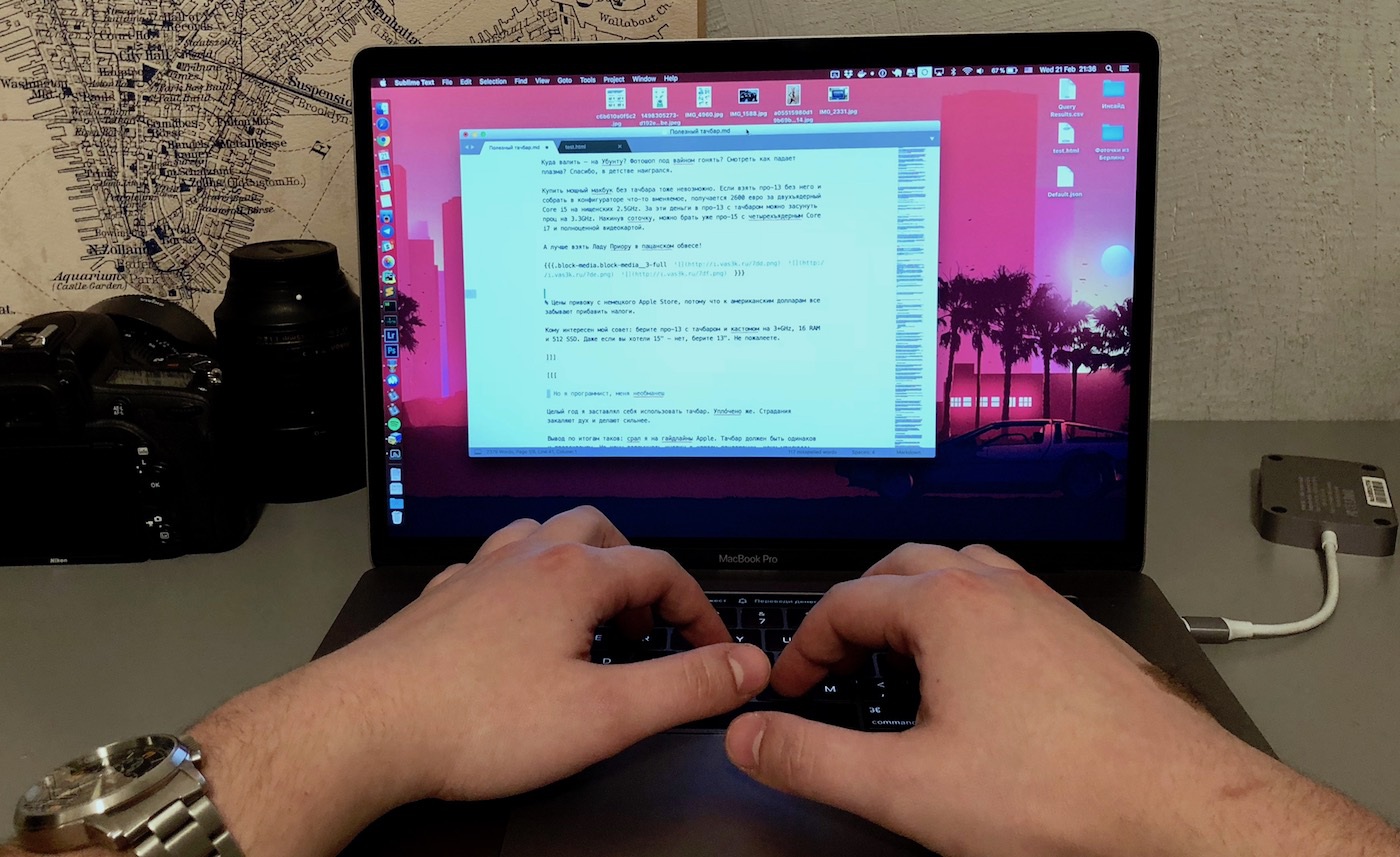
If you have, well, HANDS, you hardly see the Touch Bar more than twice in two hours. The first time, when you're leaving to get some coffee, second time — when you back with the cup of hot flat white.
No pro-user ever thought of copying text using Touch Bar or something like this, but Apple guidelines restrict any unique features. So why do I even need this crap, if it does not give me unique capabilities and takes away my F-keys.
We're doomed. MacBooks treated us well, and any other laptop feels like a cheap plastic toy nailed to the floor. MacOS is still the best, combining the usability of popular operating systems and flexibility of Unix.
What else do we have? Ubuntu? To use Photoshop in Wine? To watch Plasma crashes like in good old days? No, thanks.
For the whole year, I've pushed myself to use the Touch Bar. I've paid for that!
Here's my pro opinion: Fuck your guidelines, Apple. The Touch Bar should always be predictable. I don't want to remember button configuration for every app. I want it to be useful and informative. Just give me an additional screen, like in the early fan renders.

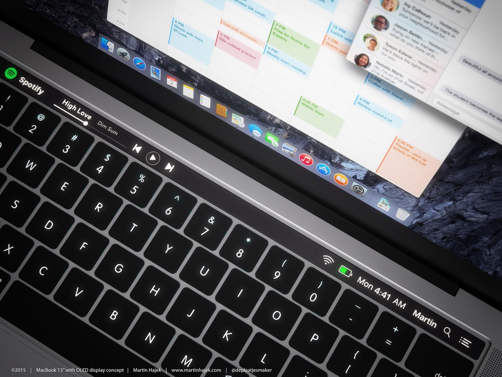
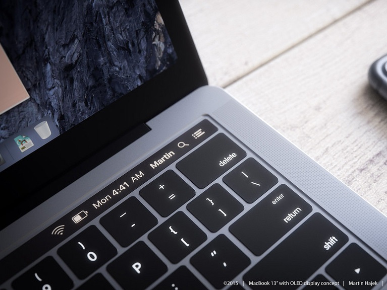
Early renders from Martin Hajek.
Saying "extra screen" gives me childhood flashbacks. To my sleepless nights, when I was coding Conky configs in ArchLinux to display on my desktop the most important things: the weather, CPU-usage, IP-address, and a FULL-SCREEN CLOCK, of course — a pride and envy of every nerdy schoolboy.
If you were lucky to be an average healthy teenager, I'll show you this nightmare:
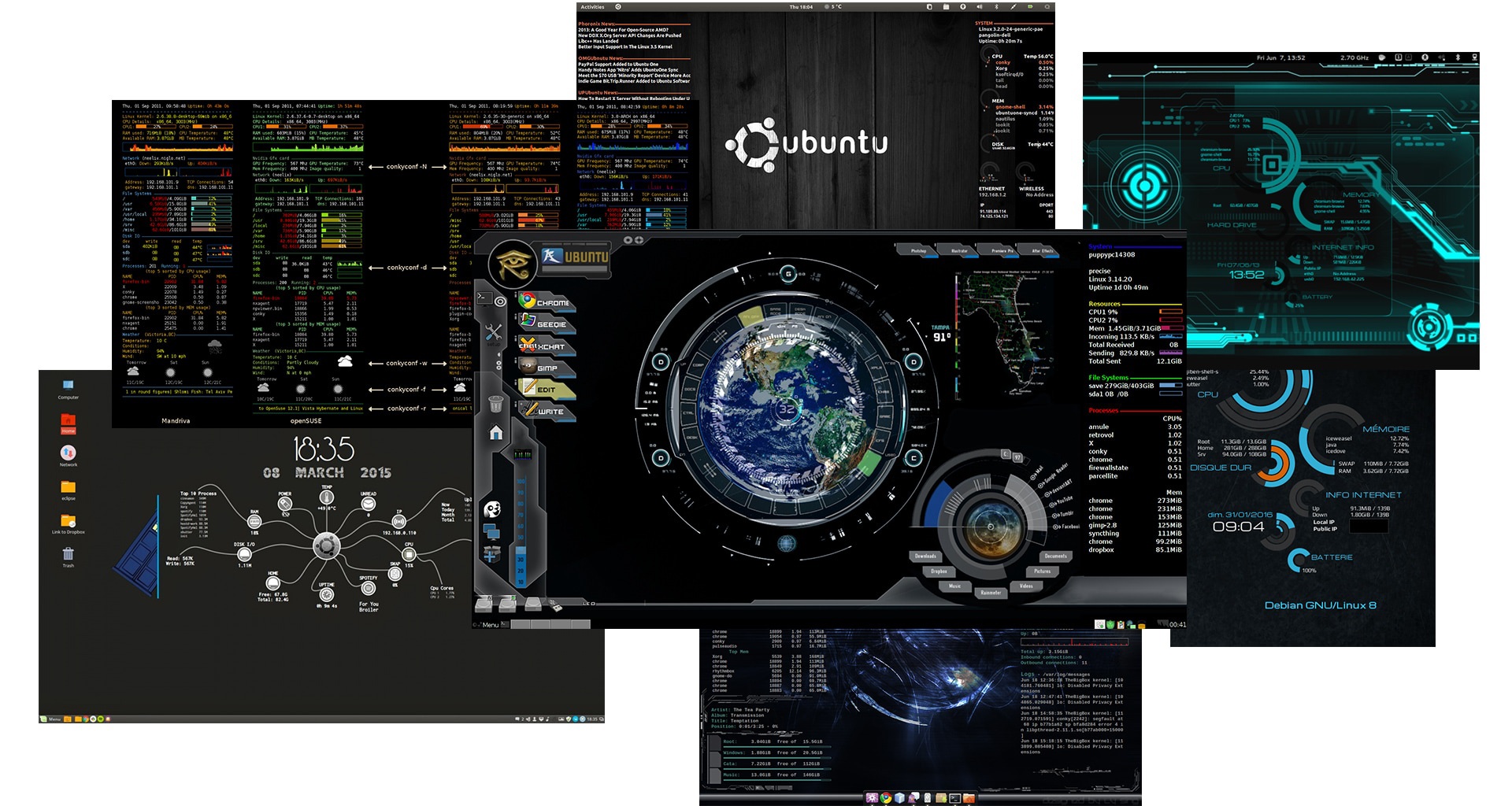
Ew, creeps! Let this shit stay in 2007. I went through it. I grew up. It looks cool and "cyberpunky" for literally one evening. You never use it afterwards.
Things must be useful, not "beautiful"
The grown-up me started to track my everyday habits and search Reddit for ideas. The only proper app for Touch Bar customization I've found, is BetterTouchTool. It's still buggy, user-hostile and drains the battery, but it only costs $5. Reasonable price, I recommend it.
I've read every single guide to the BetterTouchTool setup and came up with the following conclusions based on whether it works for me or not.
Cool | Crap
--- | ---
Name of track playing
Deadly necessary feature. I'm always wondering what Spotify's Discover brings me. | Bitcoin price
No idea why this widget is so popular. Worthless distraction.
Volume buttons
Buttons rock. It's always faster to tap, not slide. | Brightness slider
Requires lots of space but used once a week when watching "Futurama" at night.
Finder in one click
I want to have instant access to Finder, anywhere. Default Touch Bar can't do that. Weird. | RAM usage
Useless. In modern OS it's always nearly 100%. That's natural.
No, I'm not only listening to music and open Finder all day. I code, deploy my dockers, etc. All my work instruments are set up flawlessly. Touch Bar can't make them work better.
However, a lot of processes are always running in the background. Music keeps playing. New ideas pop-up — would be good to write them down. Touch Bar is a perfect place for everything you don't need all the time, but it's a pain in the ass to look for such things when they're needed.
E.g., the eyedropper tool, to take the hex color code from the screen.
Two weeks of experiments — writing widgets, trying them, observing, and now I have something to show you:

Obviously, something will change with time, but today I already see that I've started to use the Touch Bar more. Now I remember where every button is. Eat it, Jony Ive!
Here's the story of every single button.
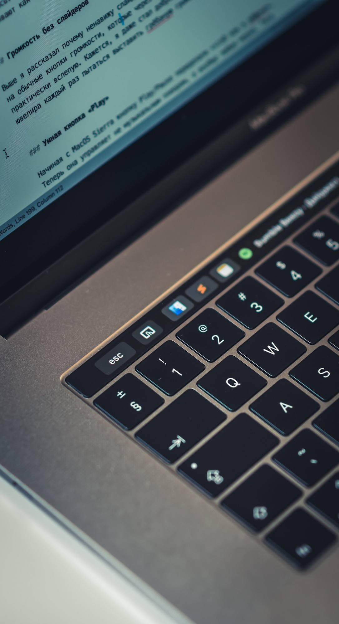
Several times My Touch Bar stopped working while Esc was hidden. No idea why hide it at all. Esc must always be tied to its rightful place. It is now, thanks to BetterTouchTool.
The button next to Esc returns the default Touch Bar, just in case you need something from standard functionality. Haven't used it yet, though.
Imagine, you want to drag a picture to a browser to upload. You click the Finder, but instead opening a new window at the same screen, it carries you away somewhere. Just because there's another Finder window opened there. And it's fucking impossible to fix that with standard MacOS tools.
Here comes the AppleScript. First, it forces a Finder to open a new window, then tells it to switch to home folder and opens it on top. That's the only way I've found.
Despite that, AppleScript is fun. You feel like playing a text RPG when coding.
tell application "Finder"
    make new Finder window
    set target of front window to path to home folder as string
    activate
end tell
upd: Found a nasty bug. Holding the Finder button for a while will launch a million Finder windows, so you're gonna have a really bad time.
I've found out that I always use these two apps and want to access them from anywhere. I don't want to exit the full-screen of my IDE to write down something to Notes.
These are two simple app buttons. Just like at the Dock. You can add any. At first, I've added a bunch of unnecessary ones, but only those two survived. I don't want to replace the Dock but improve usability.
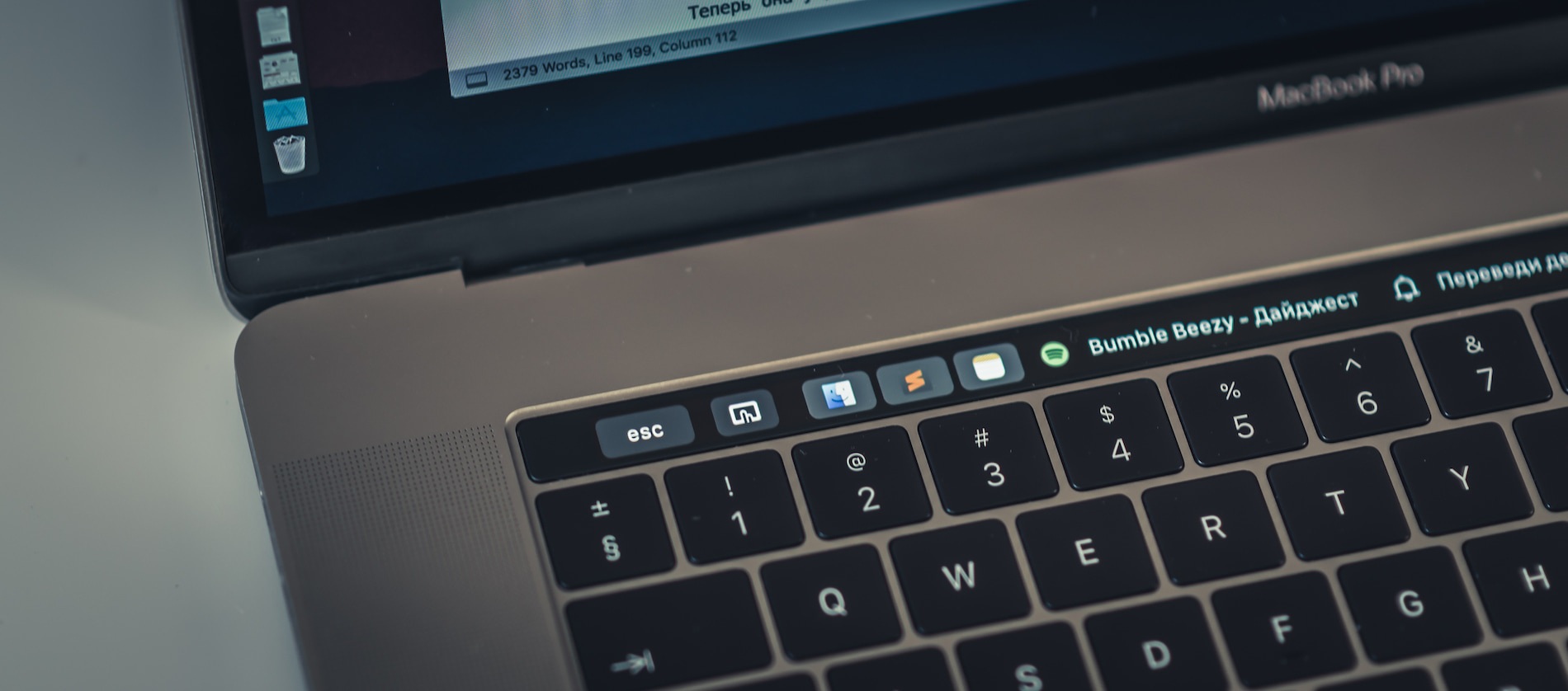
Standard Touch Bar will never support the most useful feature — to display the name of track playing. Instead, Apple provides you with huge and useless timeline slider. I don't know what's playing but know the moment in time. Handy.
Fuck sliders and buttons. I only need a track name and a cute pictogram. You can easily google AppleScript configuration for that. It works with both Spotify and iTunes, even when both are active.
In my script, the click on the name of track playing works as "next". Priceless. Especially when "Nickelback" song interferes the AI-generated playlist.
Whether there is a way to get back to the previous track? Nope. The "prev" button used rarely. No need to waste space. When I need that for some reason, I just open an app.
if application "Spotify" is running then
    tell application "Spotify"
        if player state is playing then
            return (get artist of current track) & " - " & (get name of current track)
        else
            return ""
        end if
    end tell
end if
if application "iTunes" is running then
    tell application "iTunes"
        if player state is playing then
            return (get artist of current track) & " - " & (get name of current track)
        else
            return ""
        end if
    end tell
end if
return ""
Would be cool to display the name of the YouTube video on the Touch Bar, right?
There's a script for that too. It looks through open Safari tabs and finds one that starts with youtube.com/watch. Then, displays tab title on the Touch Bar. Clicking on it gets you to the exact tab. Neat!
We have a little problem here, though. BetterTouchTool can only run the script by a timer. There's no way to make a simple browser plug-in for displaying the text. You have a script running once in 20 seconds, and praying it won't overload the CPU.
upd: CPU is fine, but the battery doesn't. I've turned it off, for now, waiting for BTT updates or will probably write my own tool with external scripting support.
if application "Safari" is running then
    tell application "Safari"
        repeat with t in tabs of windows
            tell t
                if URL starts with "https://www.youtube.com/watch" then
                    return name of t as text
                end if
            end tell
        end repeat
    end tell
end if
return ""

I do not practice a time-management. My life cycle only requires a simple todo-list and the Reminders.app. It would be nice to see the top reminder on the Touch Bar.
It turned out very well. E.g., for the whole week, I was trying not to forget to extend my insurance. Did that immediately when it became an eyesore on my Touch Bar. Now I can even tell my dumb Siri "hey, remind me to buy milk" and it appears on the Touch Bar. Nailed it — two useless things replaced with the useful one. Nice.
Clicking on the reminder opens the full Reminders list, so you can check the completed and add more.
Nay, it's not a problem if the reminder is too long, or Spotify grabbed the whole space since you can scroll this area of Touch Bar.
tell application "Reminders"
    set activeReminders to name of (reminders of list "Reminders" whose completed is false)
    if activeReminders is not {} then
        return first item of activeReminders
    else
        return ""
    end if
end tell
My personal guilty pleasure is to see what's the weather outside now. Imagine this — there's freaking cold, and you're sitting by the fireplace, covered in bees plaid, with a glass of hot wine. Or — it seems like there's a sunny and warm day, which means the adventures time!
A long time ago I even had a little utility for tracking the current weather in a tray. Probably the first app I bought.
Now I decided to make one for the Touch Bar. The main issue of such things is the hardcoded location. I always forget to change it when traveling. It's nicely done in wttr.in, where location traced through an IP.
With JSON Helper and Location Helper installed, you can write it youself in couple of lines of AppleScript. No need to buy $1.99 app from AppStore. PROFIT!
If you need a full report, clicking brings you straight to the local weather website. You can even add emojis to display the cloud cover. Take a look at our GitHub repo at the end of the article, some of my readers already made that.
tell application "Location Helper"
    set clocation_coords to get location coordinates
    tell application "JSON Helper"
        set weather to fetch JSON from "http://api.openweathermap.org/data/2.5/weather?lat=" & item 1 of clocation_coords & "&lon=" & item 2 of clocation_coords & "&units=metric&appid=YOUR_OWM_APP_ID"
        set temp to temp of main of weather as string
        return temp & "°C"
    end tell
end tell
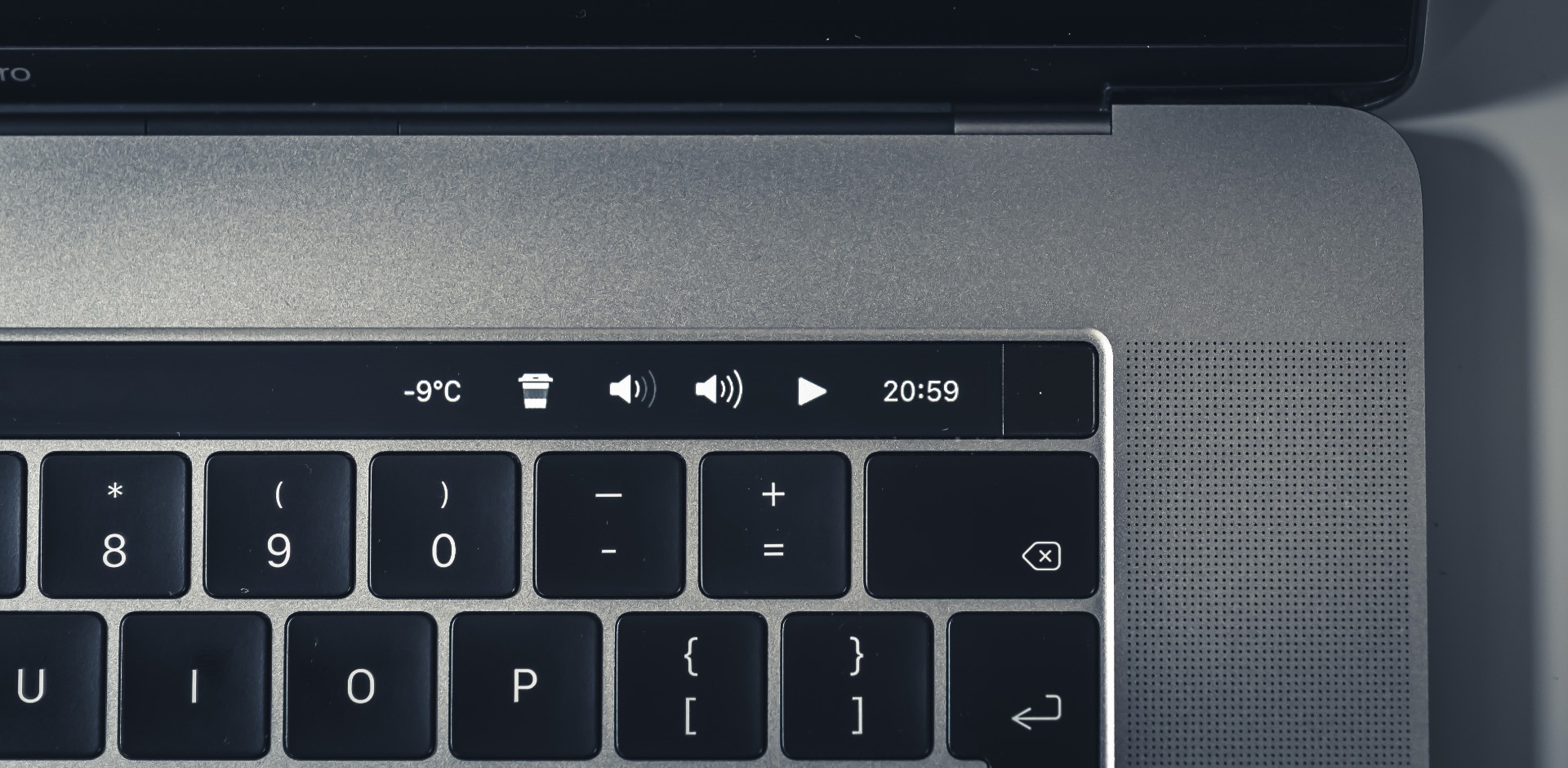
Vital rule of the office life — block your laptop when leaving. No need to explain this.
I'm not a fan of "hot corners" so I always used the Ctrl + Shift + Power shortcut before. Pity, it doesn't work on new MacBooks because of the Touch ID. The good news is you can add a button for this action to the standard Touch Bar.
I decided to steal this feature and make the "coffee break" button. It locks the laptop and switches the screen off. Extremely useful and has an adorable pictogram — everyone notices it and asks how to get one too.
Once again. I hate sliders on Touch Bar. Changing them to buttons was the first thing I did. Now I can tap them blindly. Guess, even my stress level significantly dropped when I stopped trying to put the sliders in the desired position. It was same to adjusting hot water in a shower — you're never gonna get it without burning yourself.
Look how close the buttons to each other at this part of the Touch Bar. Guidelines state to place them 2x wider. For me though, it seems like the perfect placement. My favourite size.
Starting from MacOS High Sierra Play/Pause button globally controls the system sounds. It is not a problem on iPhone, but on Mac it controls every ad that pop-up with more priority than Spotify. You tap the button and don't understand, why it doesn't stop the music. Thanks, Apple. Very convinient.
It seems like Apple is extremely proud of their amazing innovative idea and don't even think of fixing it. Some random guy from the Internet solved it with a High Sierra Media Key Enabler utility. Works neatly.
Also take a look at the BeardedSpice if you want even more control.
The AppleScript for my Play/Pause button controls iTunes and Spotify, depending on active one. If both are not running, it will automatically launch Spotify. No need to think of it.
if application "iTunes" is running then
    tell application "iTunes" to playpause
else
    tell application "Spotify" to playpause
end if
Here's one more script to change the play/pause pictogram:
if application "Spotify" is running then
    tell application "Spotify"
        if player state is playing then return "pause"
    end tell
end if

if application "iTunes" is running then
    tell application "iTunes"
        if player state is playing then return "pause"
    end tell
end if

return "play"
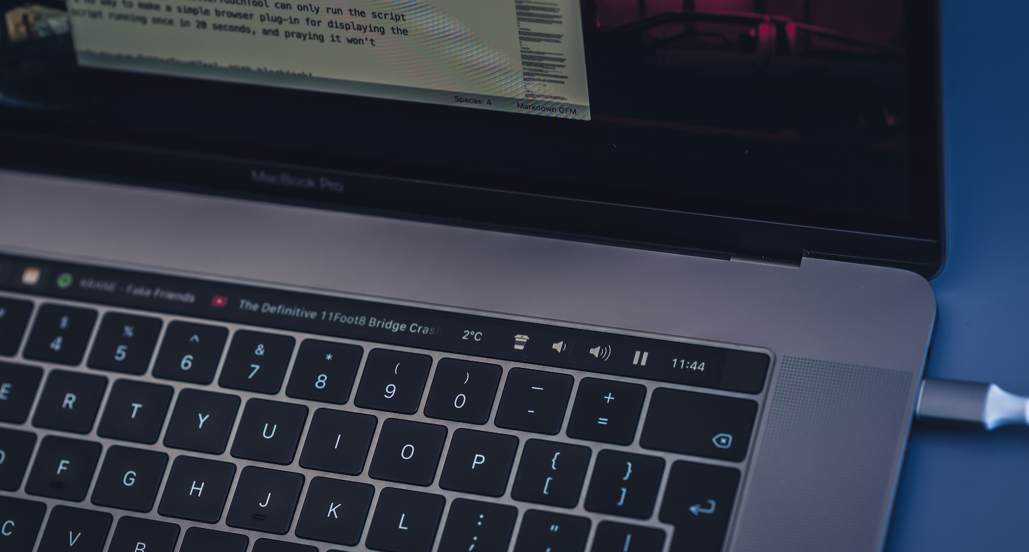
Yeah, previously I've mentioned that only Linux nerds set clock everywhere. All so. Though, there are two important and unobvious uses for them on Touch Bar.
First: you will always occasionally tap any key, placed above the Backspace/Delete button. That's the suffering area, where no action must be placed, if you don't want to activate it every 5 minutes. Probably, that's why Apple put Siri there (analysts were satisfied, I bet). For us, it's merely a spot for a clock.
Second: full-screen apps. Most of the day my PyCharm opened in a full-screen. It helps me to efficiently use the screen and not get distracted by "critical bug fix asap" messages. The thing is, you can't see time in a full-screen mode you and could easily miss the important meeting.
In short, it's useful.
Here's how my full config looks like:

Don't forget to uncheck MacOS Control Strip in Settings to fully replace the default Touch Bar:
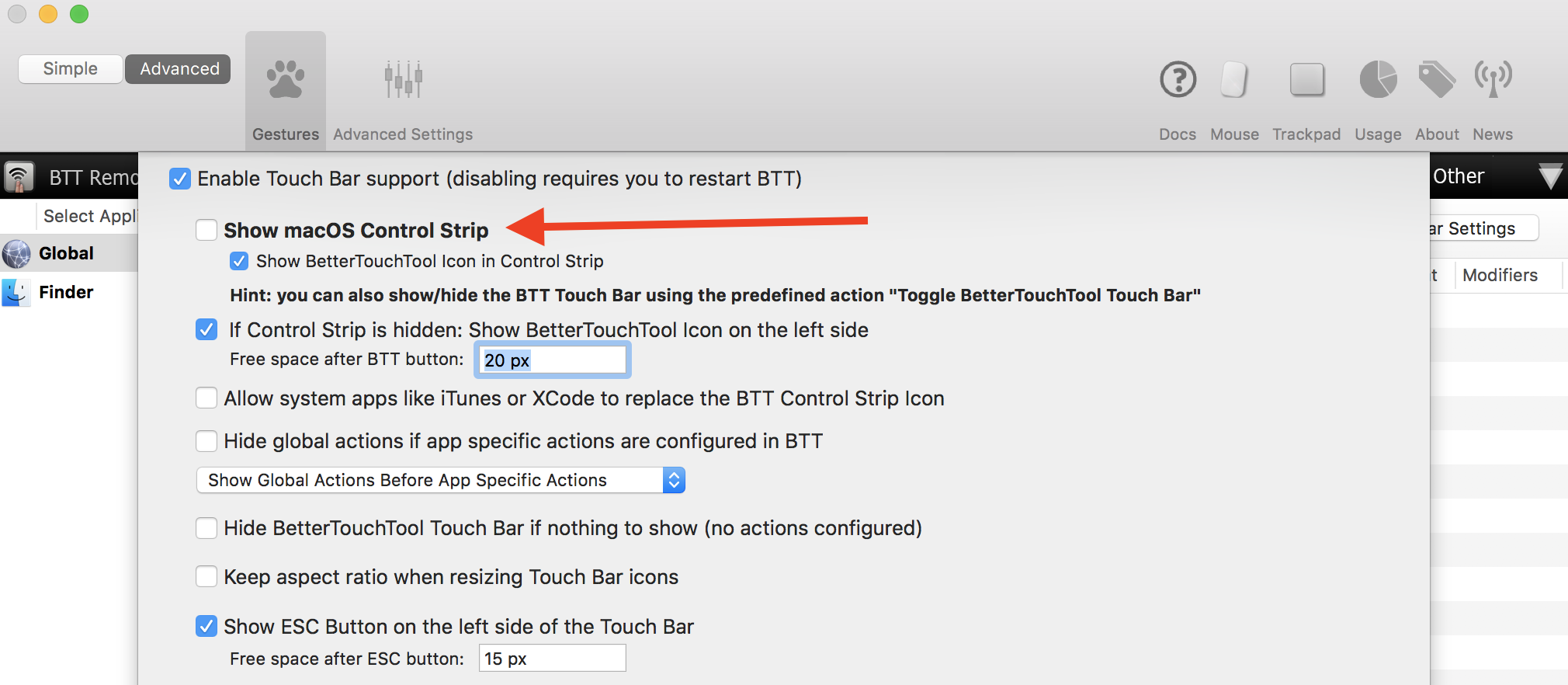
Here's the complete preset, as promised: vas3k_btt_v2.json. To import it into your BetterTouchTool, click Manage presets —> Import. To make Weather work, you also need the JSON Helper and Location Helper.
Try it. It's easy. You only need an evening to sort it out. Probably you compile something great, and Apple will hire us all because we're cool.
upd: A lot of cool guys wanted to share their presets too, so we created a GitHub-repo for that. Feel free to add your own: github.com/vas3k/btt-touchbar-presets
upd2: Much time has passed since the article was written. BTT author has added many cool features that you can use instead of our hand-made widgets. The bad news: our presets are mostly not working now. At the beginning we tried to update them for each new version of BTT, but there were so many incompatible changes that we gave up. So, just use this article as a guide and you will be able to create something even cooler. I am very proud that we had such an impact on touchbar customization and BTT itself. Thank you, guys!